Communication Tool Valuable to Staff, Family Members

Communication among staff members in a complex and challenging environment like a burn intensive care unit is critical to providing optimal medical care. With that in mind, a communication tool was designed by staff members to improve communication between all healthcare team members at the U.S. Army Institute of Surgical Research Burn Center Intensive Care Unit at Fort Sam Houston, Texas.
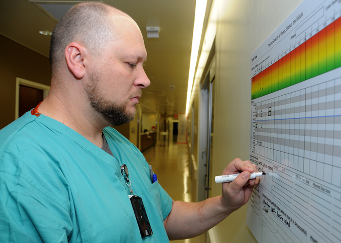
Team View is a detailed dry erase board that lists important information about the patient's condition and activities important to the team. The board is located outside of the patient's room and is updated throughout the day and used during rounds for the staff to communicate and stay aligned with patient's regiment.
While designed as a communication tool for the BICU staff, patient's family members have also found the Team View to be helpful.
"It's an awesome tool," said Kimla Holk, the mother of a BICU patient. "It allows us to see how he is doing and to keep informed of his condition. It also prompts us to ask questions when the board changes."
Lt. Col. (Dr.) Jeremy Pamplin, BICU medical director and interim task area manager for Clinical Trials in Burns and Trauma helped create Team View with input from the BICU staff for as part of a research project. The tool is part of a "Phases of Illness Paradigm" study that is designed to create valid checklists to support clinical decision making and improve communication among the multidisciplinary staff.
"We can stay in constant communication by writing notes that everyone can see," he said. "For family members, they are able to visually see the condition of their loved one and to be better informed which can prompt them to ask questions."
"It keeps us from harassing the staff, and what I mean by that is asking too many questions," said Holk. "It's brilliant and hard to believe that something this simple is so informative and useful."
Sarah Murray, research nurse and task area research coordinator for the Systems of Care for Complex Patients task area, is working with Pamplin on this research project and said that an area on Team View that family members look at every day is at the top of the poster colored red, yellow and green. During rounds the staff determines the condition of the patient by placing a dot within the colors -- a dot in the red indicates the patient is not doing very well, and in the green, the patient is doing really well.
"It allows family members to see right away how sick their loved one is," said Murray. "Nurses have told me that the family always asks them what made the dot change. I'm not sure if they would be prompted to ask those questions of the nurse without this tool."
Murray added that this is the first real feedback that she has received from a family since starting the research project in October 2014. This is possibly due to changes in how the healthcare team updates the tool that now keeps the tool consistently more complete.
"Overall, they love the tool and are very impressed that we would spend time working on improving our communication," said Murray. "They perceive the tool as a way the team is communicating to them. Even though they get anxious when the patient is getting sicker, they still appreciate the tool."
"We need communication at all levels," said Holk. "This type of communication is proof that we are getting the ultimate care from a staff that is courteous, compassionate and caring."
 An official website of the United States government
 ) or https:// means you've safely connected to the .mil website. Share sensitive information only on official, secure websites.


